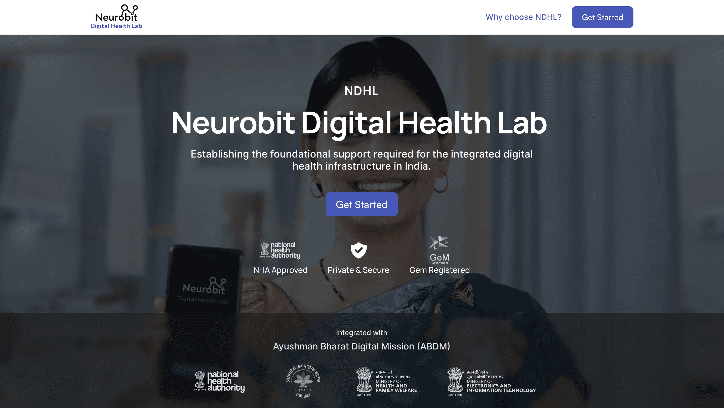
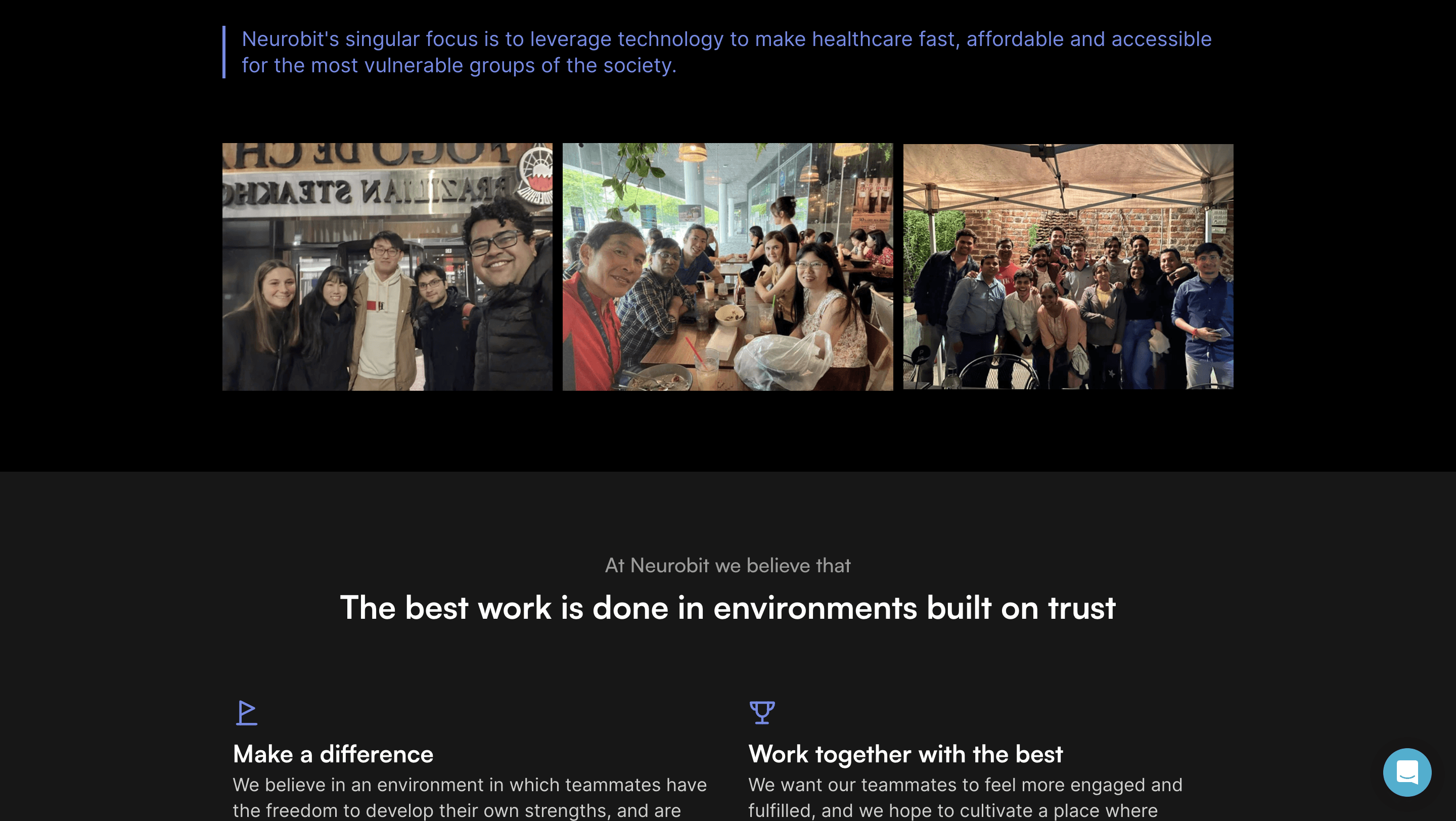
As the sole designer tasked with crafting and setting up Neurobit's online presence, I took charge of everything from design to deployment. I was given the responsibility to conceptualize, structure, design, animate, build, and deploy the Neurobit website and set up blog CMS.
With limited time and resources at my disposal and no assistance from developers, I had to approach the project with a clear vision in mind.
Before delving into the website architecture, it was crucial to consider several key factors — Identifying the target audience for the website and determining how to design product pages to cater to diverse customer segments. ; Clarifying the purpose of the blog: whether it serves primarily for SEO or provides valuable content to users. Establishing these goals helped guide my approach and ensure alignment with the project objectives.
Following extensive discussions with the sales, marketing teams, and co-founders, I established the following objectives:
The landing page will focus on conveying Neurobit's vision and overarching concept without product-specific details.
Visual language on each page may vary slightly to cater to different target user segments for various products.
Proper setup of the blog CMS was prioritized to ensure seamless integration of any changes in the content strategy.
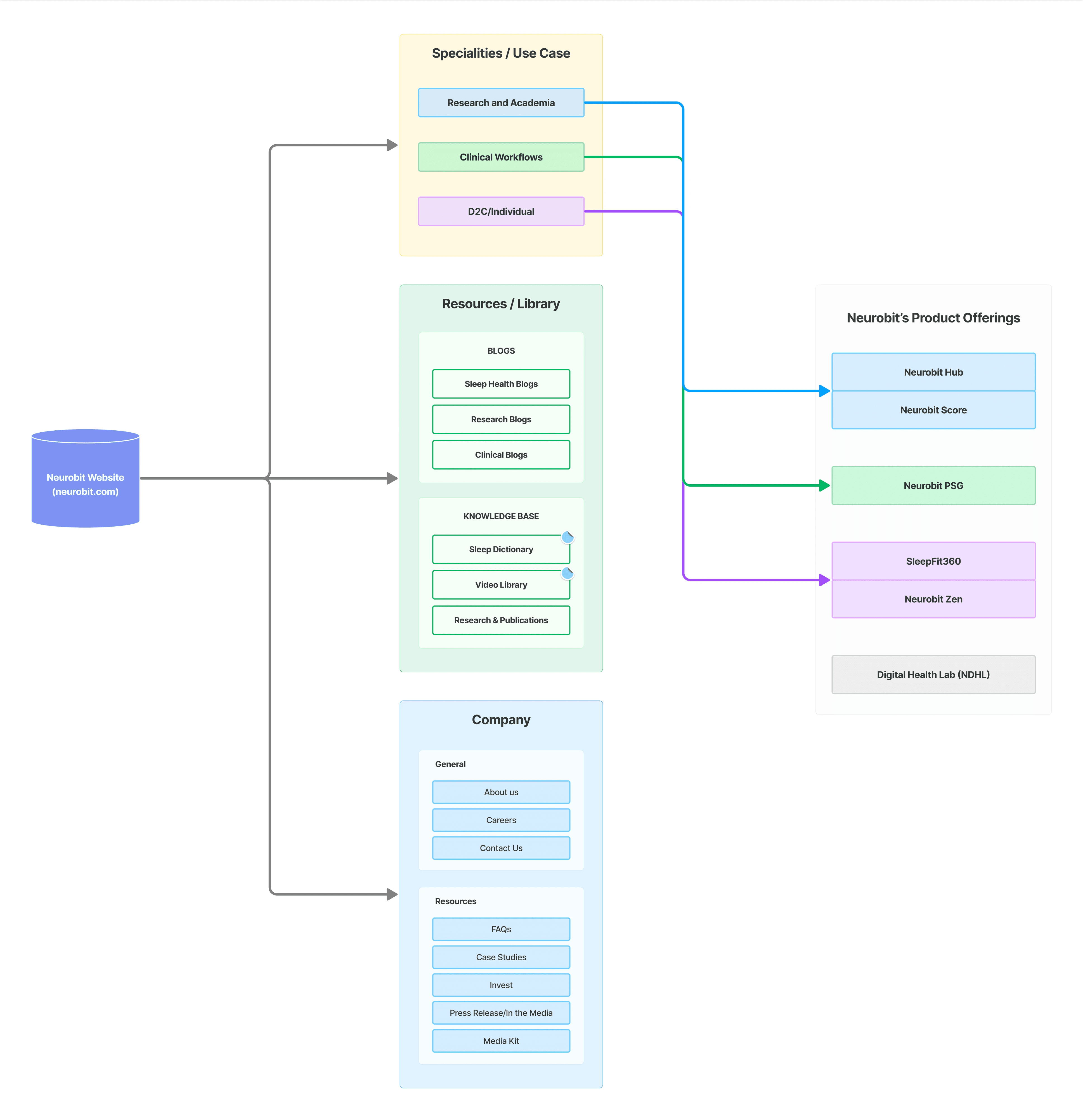
Neurobit Website Architecture
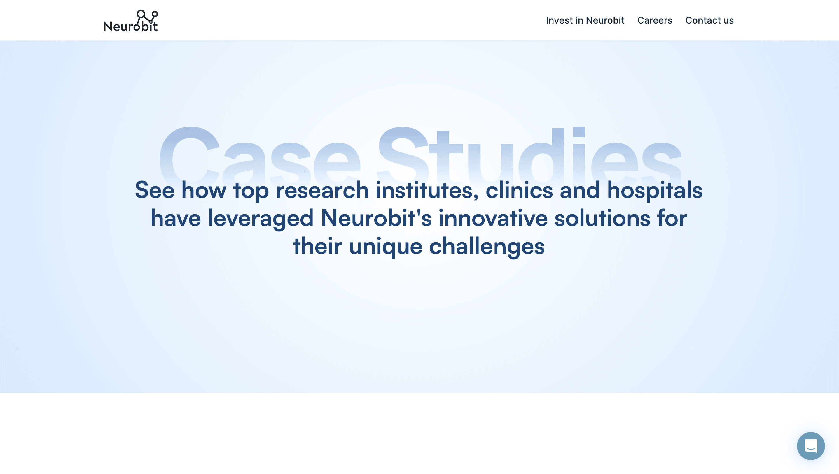
Neurobit's diversified products had different target user segments, hence it was crucial to make sure to design each product page effectively to showcase its unique offerings. Here, I will only be talking about two products: Neurobit Hub and Neurobit PSG.
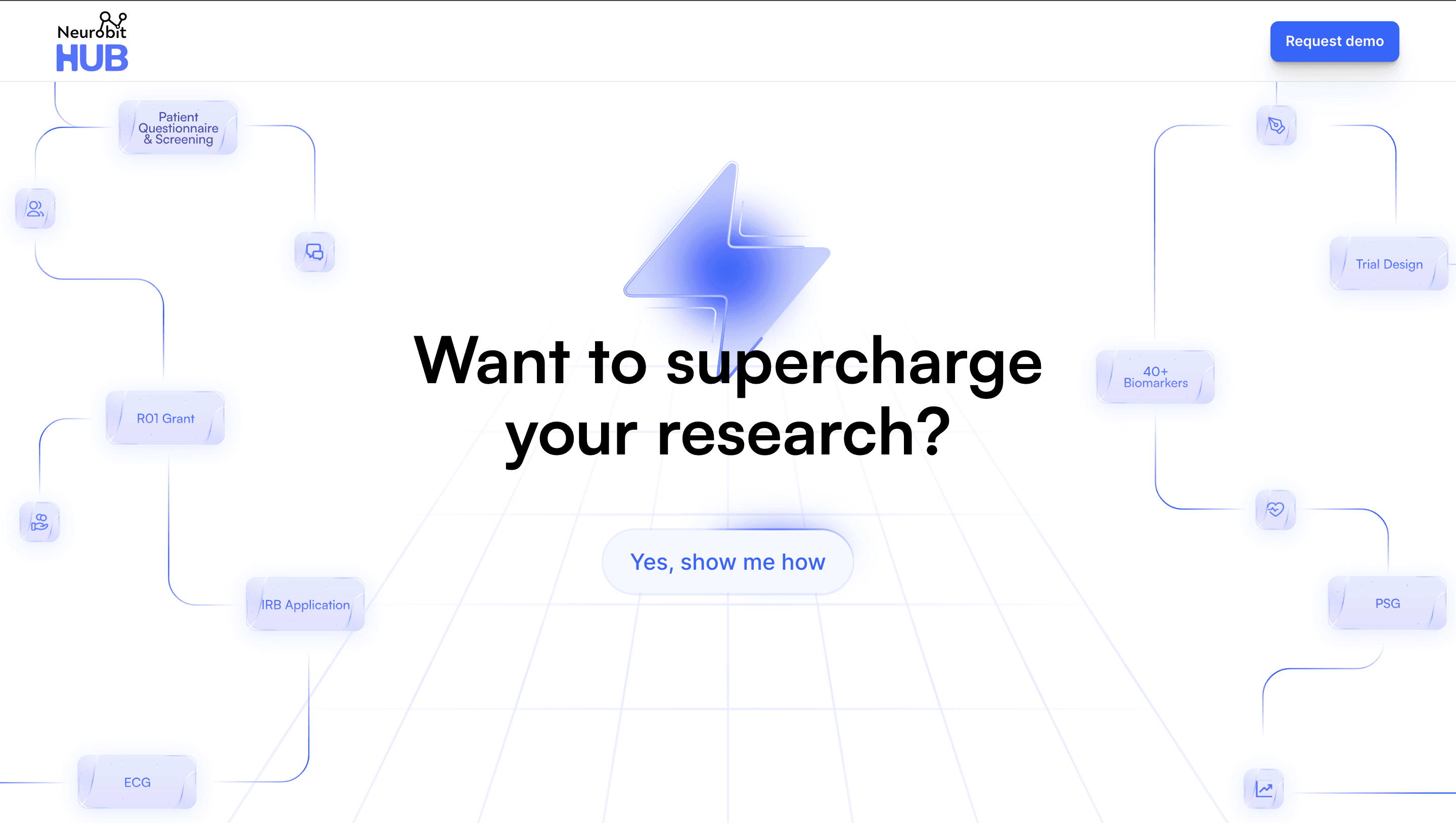
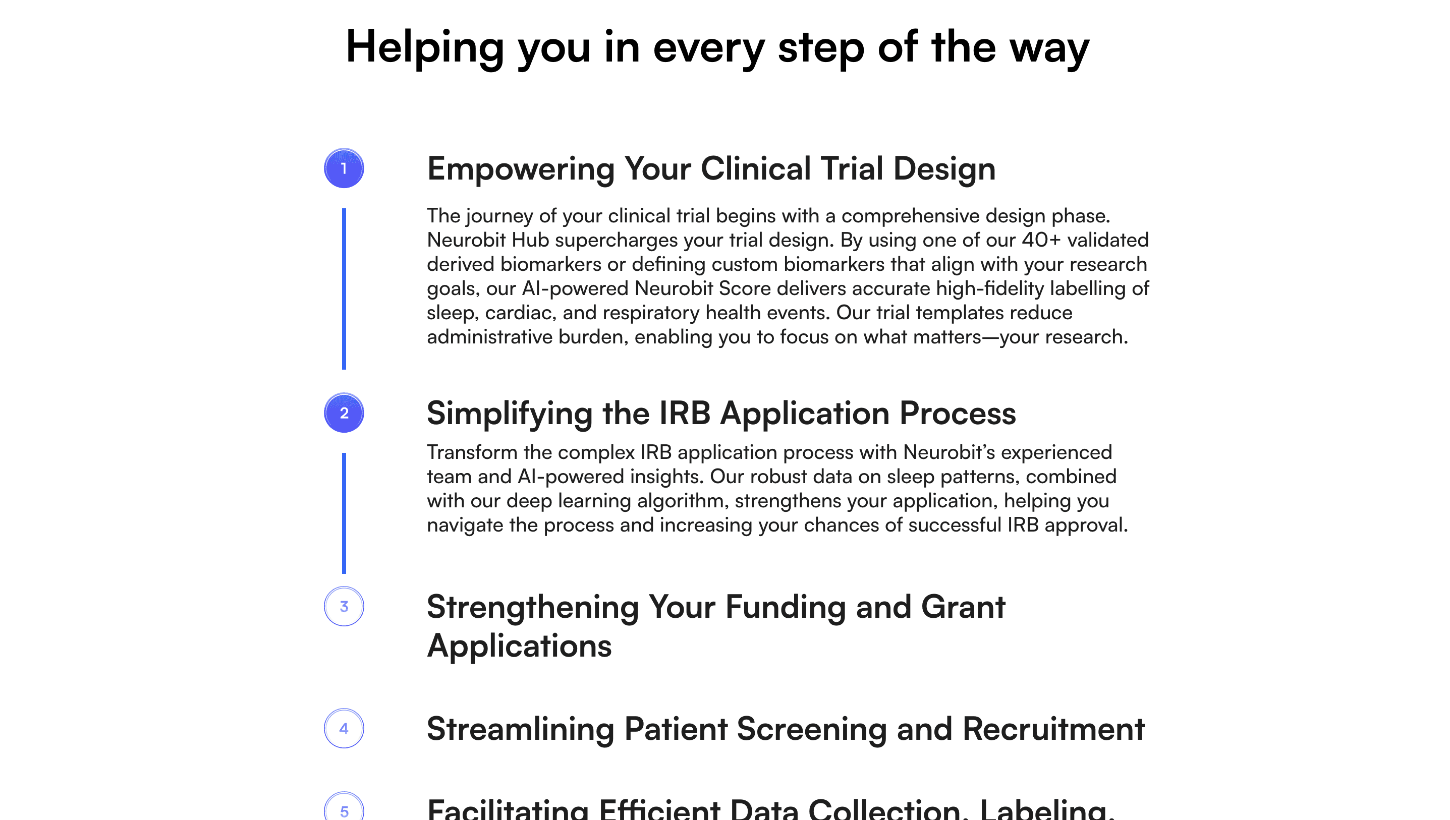
Neurobit Hub is a comprehensive web-based tool designed to revolutionize the clinical trial process in sleep and population health research. I really wanted to highlight how this product simplifies the entire clinical trial journey and increases the efficiency of population health research.
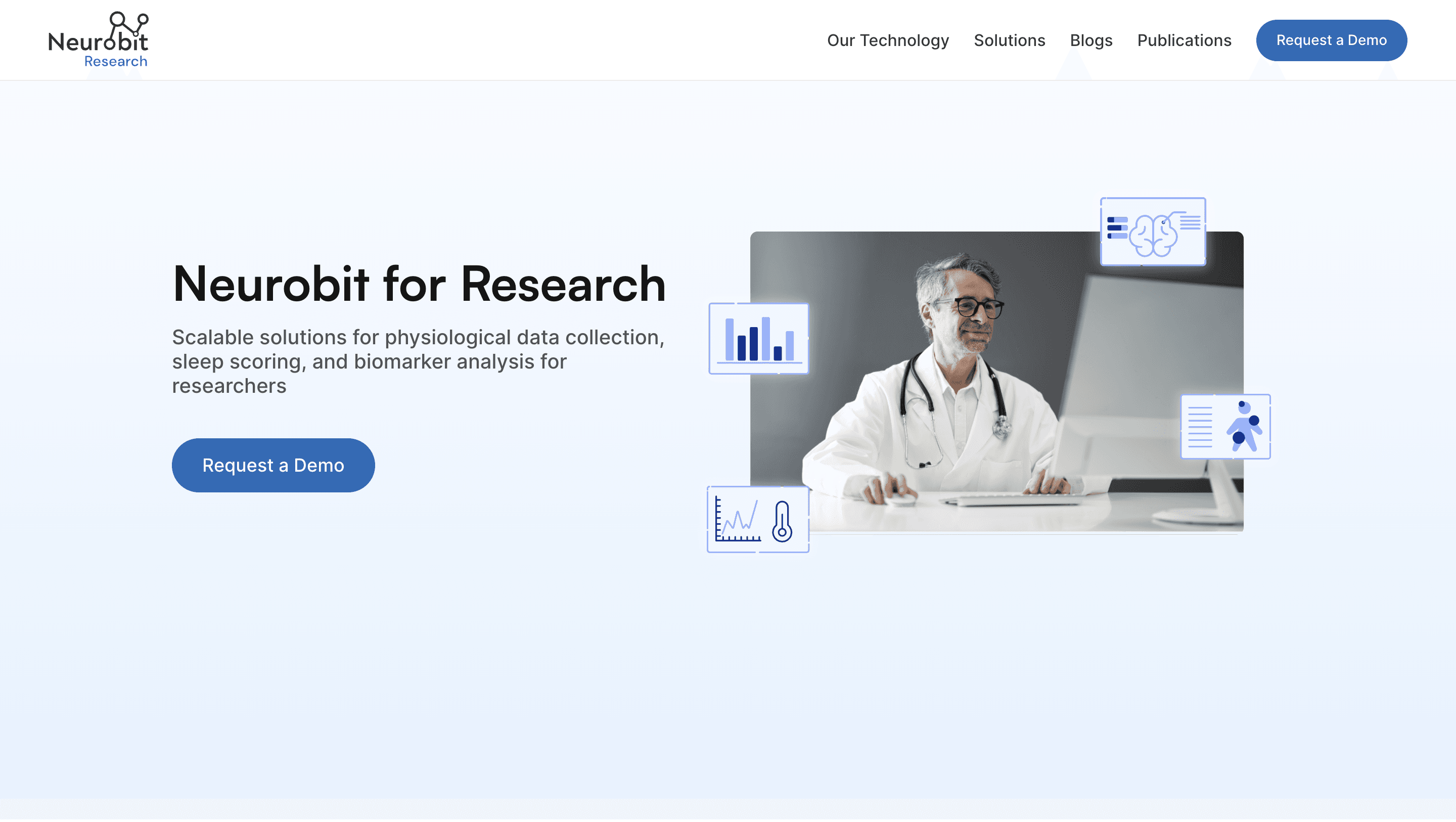
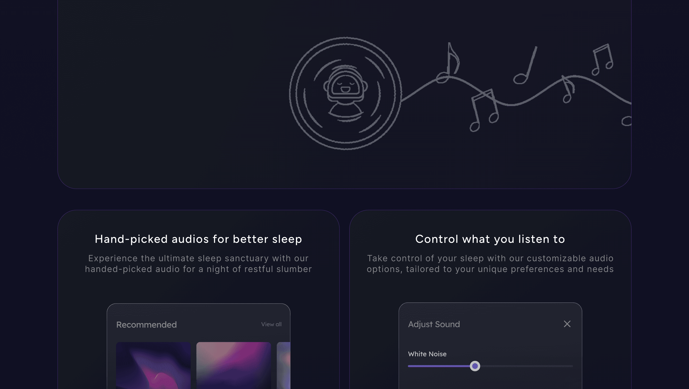
Having worked as a product designer on Neurobit PSG, a clinically validated and deep-learning-enabled platform for auto-scoring and precise sleep event detection, I knew this product inside out to understand it's intricacies. I approached the design of the product page with a focus on highlighting its features interactively and creatively, directing customers' attention to its most valuable aspects.
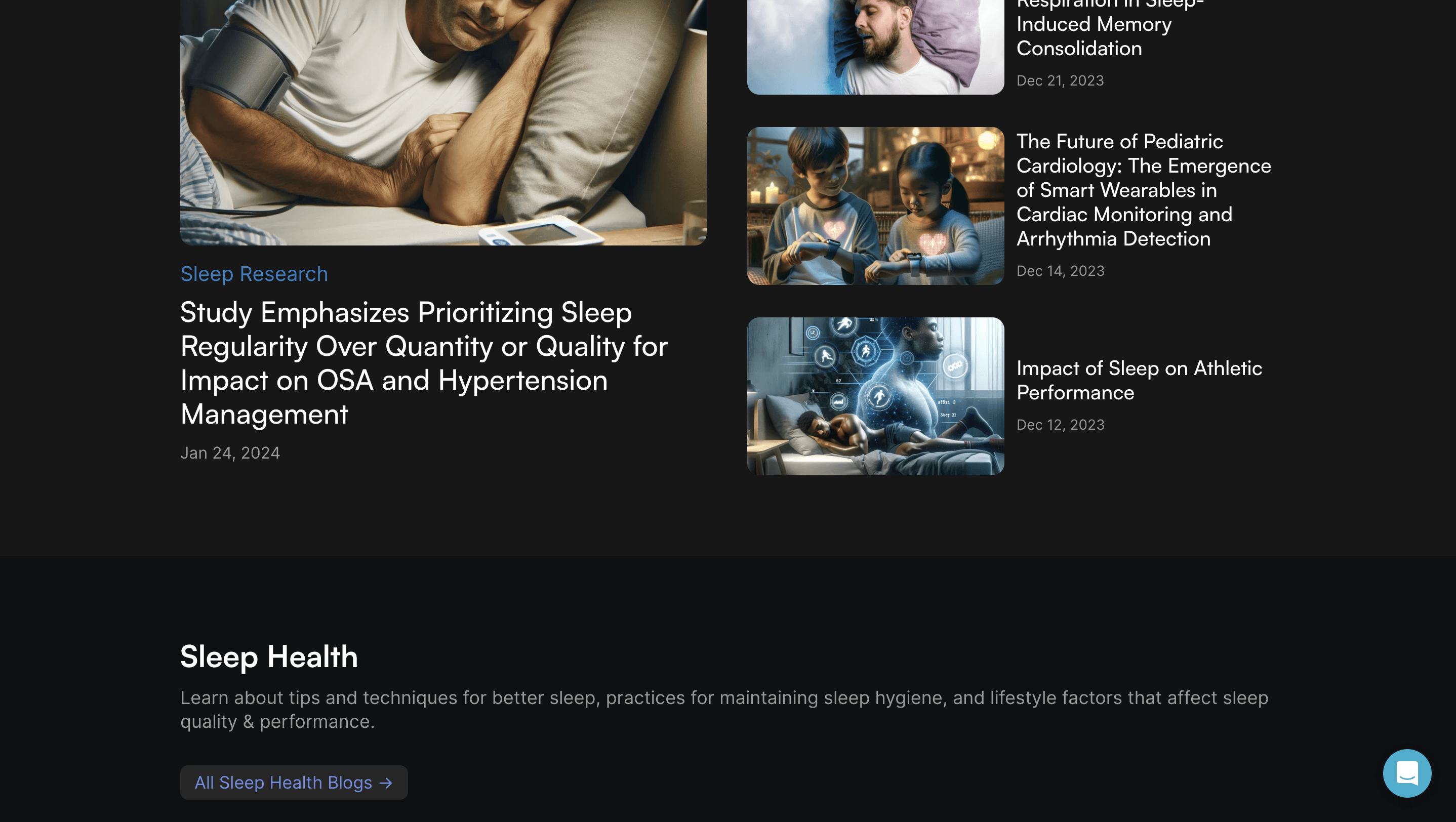
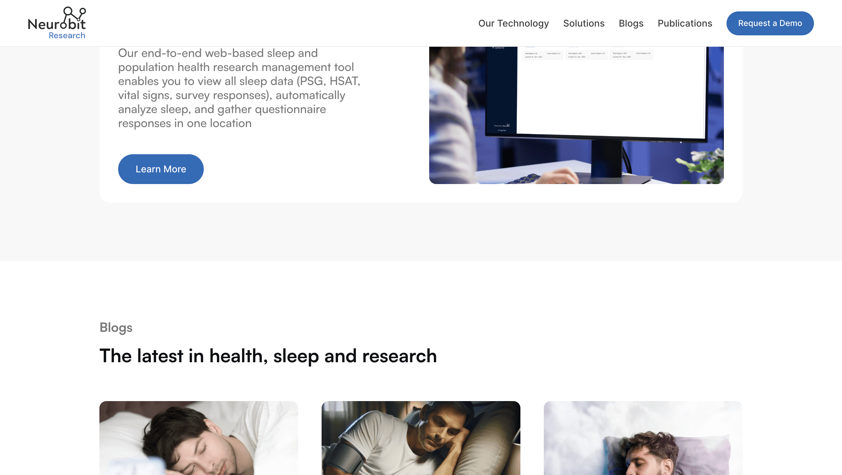
The Neurobit Blogs page was one of the most important components of the website. My primary objective was to ensure efficient content management, facilitating the seamless addition of content by independent blog writers. Additionally, I structured the blog to categorize and maintain various types of content effectively.
A solid CMS file structure was essential to maintain consistency across diverse blogs, especially with multiple writers contributing content.

CMS file structure
For the blog structure, I decided to divide all the blogs into 3 categories:
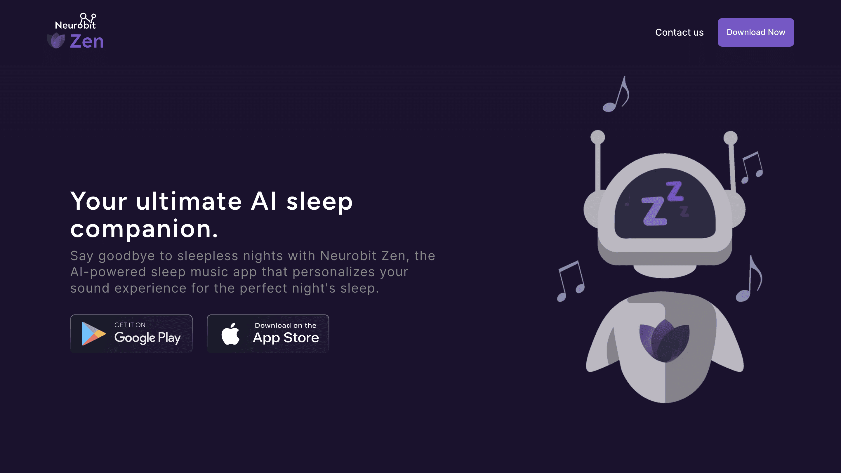
Sleep Health: Blogs covering sleep health, lifestyle, tips, and techniques were grouped here, aimed at general consumers. Additionally, a prompt for SleepFit360 & Neurobit Zen products was included.
Research: This crucial category featured blogs on sleep research written by independent contributors. Our goal was to establish Neurobit's research blogs as a reputable source, with relevant products like Neurobit Hub and PSG prominently showcased.
Clinical: Here, blogs related to sleep disorders and conditions were added. Neurobit PSG was the product we decided to advertise.
After the website went live, we used Google Analytics and saw very positive results —
Website Traffic
Significant increase in monthly website traffic over the past year.
Reached a peak of 5,000+ monthly visits
Improved User Engagement
Average Session Duration: Increased from 1m 32sec to 2m 51sec
100% increase in blog views and social media engagement
Positive feedback
Co-founders and stakeholders expressed satisfaction with the website's impact on brand perception and user engagement.
